UI Design Tools (and The Role of the Designer) Have Evolved. Are You Coming With?
Adobe Fireworks Didn't Float Left
For decades, the gap between what a designer imagines and what a developer ships remained stubbornly wide — not for lack of ambition, but because imagination and implementation speak different languages. One fundamental disconnect was spatial: design tools let you place elements exactly, stacking them on a z-axis. HTML floated divs and let the document flow decide. The CSS developer translating between those two worlds was simultaneously wrestling with document flow, hunting for the unclosed div, and trying to figure out whether that extra spacing came from margin on the inner div or padding on the outer one. Meanwhile, back in the design tool: divs, margin, and padding weren’t even concepts.
Any of you who used to create mockups in Adobe Fireworks know what I’m talking about. I go that far back and have prototyped in each evolution of tools since then. The tools kept getting better at translation. What’s changed recently is something more fundamental: the gap between design and code is disappearing.
From Flat Comps to Component Structures
Eight years ago, my prototyping approach was to build flat comps and stitch them together in InVision — linking hotspots, exporting assets, and handing off PDFs that developers then had to interpret by hand. That last part was the real cost: a developer opening a comp and having to guess at spacing, reconstruct component logic from static images, and flag every ambiguity in JIRA or a Slack thread that derailed both of us.
Designers had two options for managing the chaos: build a long, detailed design system the developers would mostly ignore, or skip it and spend that time fielding ad hoc requests for sizing and spacing values instead. Neither was a real solution. And when responsive layouts entered the picture, design patterns that had seemed solid on a static page broke in ways nobody had anticipated — because a static page couldn’t anticipate them. Six years ago, Adobe XD shortened the loop: purpose-built for interface design, with repeat grids, auto-animate, and a tighter handoff story. Four years ago, Figma closed the gap further — design tokens that mapped directly to CSS, component structures that thought in the same terms as React, and a shared file model that finally put designers and developers in the same room.
The UX Design Role
The role of UX design has shifted alongside all of this. The careful planning of sitemaps, wireframes, and user flows was critical when the design phase was three months and development would take a year. Now that those timelines have compressed dramatically, much of that work is replaced by high-fidelity iterative prototyping — you learn faster by building than by diagramming. User and market research have always been part of the UX role. Now they’re indisputably the centerpiece of it.
Closing The Gap Between Design and Code
A year ago, I made the leap to Figma Make and prompt-based design. Figma Make moved more of the design-to-code translation into the design phase itself, and started pulling accessibility compliance upstream where it belongs. The standard practice had always been catching contrast failures and missing focus states at the developer stage — under deadline pressure, when fixing them is expensive and demoralizing. Doing that work earlier changed when it happened, not just how.
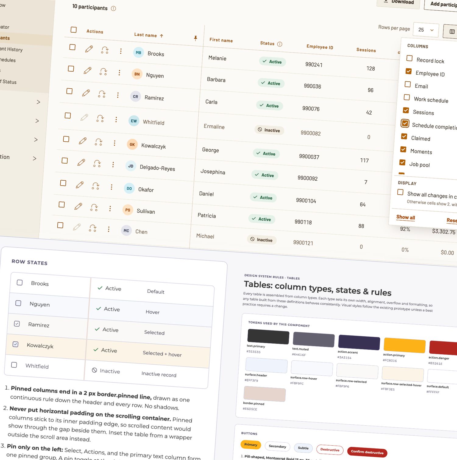
More recently, I started prototyping directly in Claude. The gap between design and code is now whatever I decide it is — including nonexistent. On a recent design system project, the deliverable wasn’t annotated mockups; it was Claude-ingestible component code the dev team could build from directly. That wouldn’t have been a coherent idea two years ago. What’s changed isn’t creativity. It’s constraint. I can try something, see immediately whether it works, and adapt when scope changes break an existing pattern. I have a partner for researching best practices and executing them in the same breath. The real gain is staying in the problem — context-switching is the creativity killer, and when you don’t have to stop designing to figure out how to express something in code, you stay in it. The outputs are more polished, more consistent, and closer to shippable than anything I produced before.
The Elephant in the Room: AI
Beyond product work, I’m a designer, writer, photographer, and marketer. One fair read on this moment: every discipline I work in is being disrupted by AI right now. Another read: AI is making me better at all of them. I'm taking on bigger challenges (and risks) than I could have managed before, and spending more time on the parts of the job I actually love. Both reads are true. The article you just read is my evidence for the second one: I’m spending more time in flow state, and less time in those Slack threads.
Right now, I'm working on a design system retrofit for a product that has survived years of stack and best practice changes. I'm able to create one set of rules for "as close as possible" (with solutions recommended for variance drift within the product) to current state, another version that aligns the product with current best practices, and a third version that shows my vision for the future of the product. Imagine trying to keep up with all of that a few years ago.
The question the industry is still working out isn’t whether AI belongs in the design process — it’s what designers do with the time and creative bandwidth it returns to them.